Recycling the material – VillageArts, Kohukohu

9May

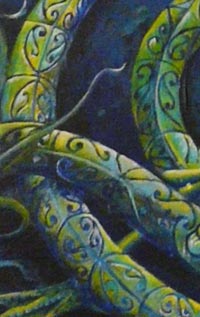
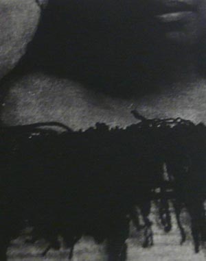
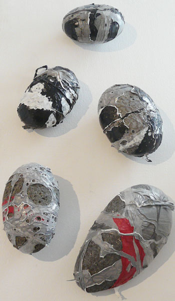
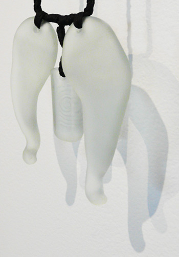
Sarah Lenton’s plastic wrapped stones are a three dimensional composition of greys, black, white and red.


“It is not a tale invented but a confirmation of what went on before it…” is a quotation from the Quran (Sura 12, verse 111) which speaks of how everything including religious truths are nothing new: that is, everything is recycled, comes around again. The message is recycled although the materials or cultural lens may differ, and so Meaning boils down to a subjective contexutalized point of view.

For decades contemporary artists, have recycled the materials of objects, sometimes with the aim of raising awareness of the effect of context and at other times purely as a medium.

Although a recycled item can never be as ‘modernist’ as the medium of oil on canvas or steel or marble because when an object gains a new life in the context of an art institution (whether an established gallery or not) the viewer will immediately notice, for example, that this old shoe is hung vertically and not on someone’s foot. The context of an art gallery would obviously change the aesthetics of the shoe (we might examine it for the colours and textures or for wear and tear). But the viewer might also wonder why are the walls at eye height in an art gallery so important or why do we have the culture of the rectangular stretched canvas? But what about a show that throws light on the theme of rubbish? Where relocated recycled or found objects are invested with values.

“Rubbish – a new collection” is the latest exhibition at the Kohukohu Village Arts gallery in the Far North of Aotearoa | New Zealand where 29 artists have recycled the material.

Artists such as Méret Oppenheim (see her 1936 teacup and spoon made out of fur.) or Pablo Picasso (see his 1942 bicycle seat “Bull’s Head”) have been using ‘found objects’ in their art since the 1920s but in this day and age where we are increasingly aware of the renewability of materials, it is no surprise that many artists choose recycled materials over a blank canvas.

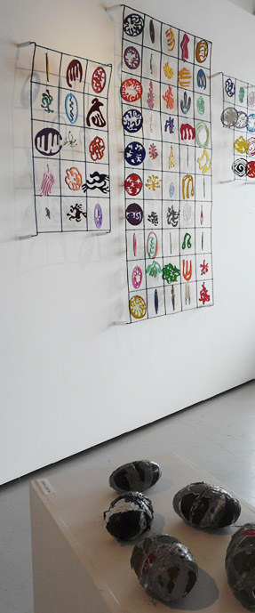
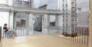
A detail of David Stanley Benson’s grid-locked mobiles in the empty spaces of three pieces of unused concrete reinforcing bar and below Sarah Lenton’s plastic wrapped stones.

Some choose this for economic reasons. Others for ecological reasons, and some for the conceptual (the extra story or double meaning).

Some use the recycled as a medium while other artists use the recycled as part of the message in their work.

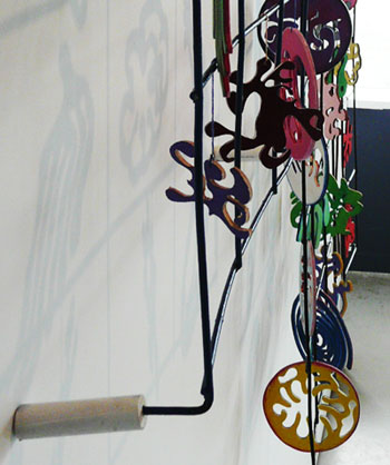
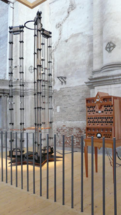
A detail of David Stanley Benson’s sculpture.

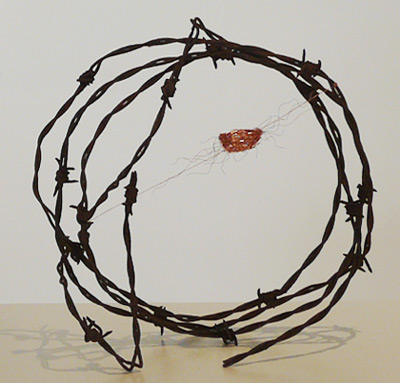
One of three sculptures by Lindsey Davidson in which copper wire is delicately held inside the protection of a barbed wire structure.

Most artists in this show, such as David Stanley Benson and Sarah Lenton have used recycled objects as the medium. Benson cut shapes out of wood offcuts and in suspending these inside the grid, his work emphasizes the frame within the framework of a triptyph, a traditional format for art story telling from a bygone past. His Matisse-like cut-outs hang freely yet each is enclosed – perhaps a metaphor for the mundane, the urban or futile. Each individual element throws a shadow beyond the frame, yet each is still dependent on the grid. Instead of the concrete reinforcing being filled with concrete, each ‘element’ has been ‘concreted.’

Sarah Lenton’s plastic melted stones function in more abstract terms. They are a three dimensional composition of greys, black, white and red.


Lindsey Davidson’s three barbed wire and copper sculptures are poetic spatial inter- ventions. Each copper bundle is surround- ed by a barbed defense system. Perhaps a metaphor for the dependency of the vulnerable elements within an eco-system or the mutability of the systems themselves, given that some of the barbed wire was rusting.

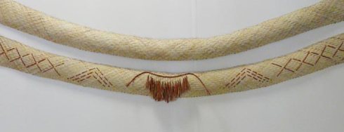
While most recycled materials in the show are used as a medium that replaces paint or marble, some, such as in Michelle Mayn’s woven “Recycled Rain Cape / Pākē,” (A pākē = a New Zealand Māori rain cape) bring in the socio-political or the cultural lens.

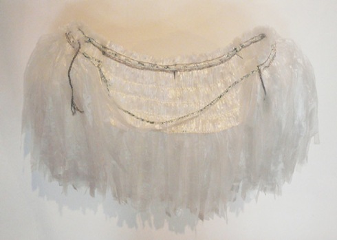
Woven computer wire and plastic pākē (Maori rain cape) by Michelle Mayn


In any other exhibition or context, we wouldn’t notice whether the plastic or wire was recycled or not because what stands out is the delicacy of the form suspended out from the wall and the fine weaving. Traditionally pākē (rain capes) were made when needed from leaves found at hand in the bush. By making this pākē from plastic and wire, which are commonly found discarded, she is continuing the legacy of other contemporary New Zealand based weavers who work traditionally with new materials such as Ani O’Neill or Anna Gedson. However Mayn’s work is more sculptural and in this context this work is a statement about how art can change the material. Cold plastic and discarded computer wiring gives form to something soft and protective.

Mayn’s delicately woven sculpture-come-fashion-statement is also a reminder that rubbish is in the eye of the beholder.

Detail of a pendent by Tavis Jacques

Tavis Jacques’ pendents also reference the worlds of design and fashion. The material, glass shards, appear sea worn. Washed up glass is not only rubbish but a sign of disregard because at some point it was thrown into the sea by someone. The artist has redeemed the insult.
The works display a delicate balance between form (the sculptured and irregular contours as well as minimal traces of what was once a bottle) and design (the forms are almost wing-like and the carved incisions are a double spiral). Rubbish is recontextualised as ornament.

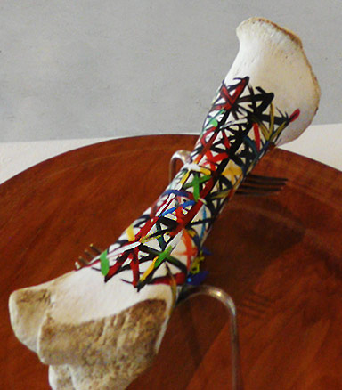
“Down to the bone” by Sue Matthews is as painterly as it is sculptural and conceptual.

“Down to the bone” by Sue Matthews is a cross between a Maddox (Allen Maddox (1948-2000) was a New Zealand known abstract expressionist painter) painting and a fluxus object. Matthew’s combination of painting, sculpting and assemblage are akin to the Fluxus use of intermedia.

The title refers not just to the bone held up like a trophy above the kauri platter by a pair of forks but also refers to scraping the barrel, using things to the last drop. The paint, her statement informs us, is scrapings from paint tin lids while the platter is a warped reject. Here rubbish is what has been conserved as well as the found or collected objects. There is painterly delight, sculptural magic and conceptual wit in this work.

It is an associative work where the edges between one medium or idea merge with another. Perhaps the next time we scrape the leftovers from the plate life gives us, we might think what else can be made of them.

The “The Bix-Box Racer” + “The Bix-Box Racer” by Malcolm Ford.

Malcolm Ford’s model planes are other works which are a rich combination of the conceptual, the ecological and the material. “The Bix-Box Racer” is a model based on a 1930s single seater 7 cylinder radial plane built for speed. It is made out of weet-bix cereal packaging. Weet-bix was the iconic New Zealand energy breakfast meal for those of us growing up in the 60s to 80s.

His biplane titled “The Bristol Black Sack,” constructed out of discarded corrugated cardboad covered with a black rubbish collection bag, is based on a combination of the German, French and English biplanes developed towards the end of World War 1. The art of model making is generally concerned with the presentation of a faithful representation aimed at the illusion of a copy of a larger item. In using recycled packaging as well as a rubbish bag, Malcolm Ford has turned this concern with the craft of representation on its head. Then as if this is not enough, he melds the elements of the German, French and English biplanes so the distinctions between those who were at war in the skies of 1918 are dissolved into one art statement. Time does not stand still and we should beware of a nostaglia that is uncritical.

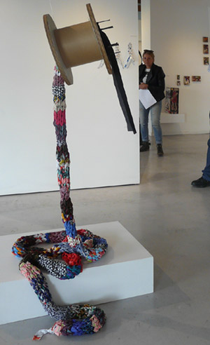
Left to Right: “Down the Rabbit Hole” by Marg Morrow, “In Milk We Trust” by Sonja van Kerkhoff, and abstract collage compositions by Erika Holden

In Marg Morrow’s work “Down the Rabbit Hole,” scale is what you notice first.

The ‘rabbit hole’ refers to the metre long tube of fabric created by knitting discarded clothing. This Odenburg-esque soft sculpture hangs from an enormous spool that in turn is suspended from above. Unlike Oldenburg however, what you notice is the combination of recycled elements. So for example, you can clearly see that the cable spool serves as a scaled up cotton reel.

Liz McAuliffe’s approach is to collect, order and display. A wall shows her suite of five “Collections.” Three are found objects, such as a wheel hub and a piece of wood, which have been hung like trophies on display. Two of these collections consist of arrangements of objects on shelving.

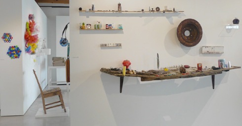
Left > Right: Fused plastic by Sarah Lenton, Wall Flowers by Christine Butler, + Yellow plastic with wire and other objects on the wall are by Lynsie Austin, Chair with metal protusions by Beverley Cox. The objects + shelving on the front wall are “Collections” by Liz McAuliffe.

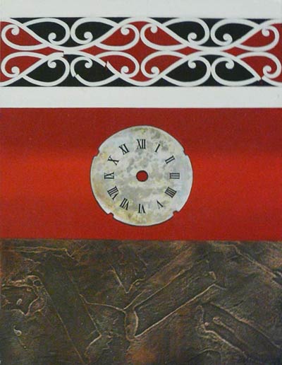
A detail of “Collections: A Measure Of Time” by Liz McAuliffe.

In “Collect- ions: A Measure Of Time” objects have been placed at markers along three wooden rulers. The top ruler is dotted arte povera-like with rusted and flattened found objects. Perhaps they mark the passing of time? To me they are reminders of treasures in the unexpected. The second row consists of packaging and the third a row of small bottles. These remind me of Damien Hirst‘s cabinet displays of ordered collections.

Rubbish!
a new collection

April 11th – May 14th 2015
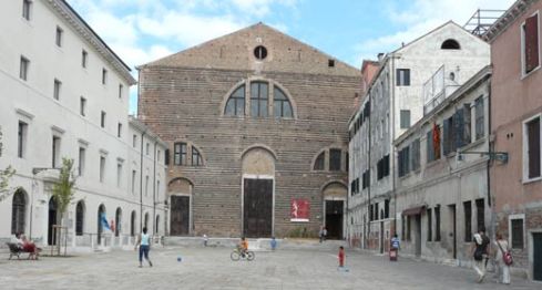
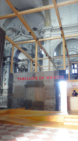
Village Arts Gallery, Kohukohu, Hokianga
www.villagearts.co.nz

Artists in the exhibition are:
Hebe Albrecht, Lynsie Austin, David Stanley Benson, Christine Butler, Beverley Cox, Janine Creser, Lindsey Davidson, Claire Deighton, Malcolm Ford, Wally Hicks, Erika Holden, Tavis Jacques, Leona Kenworthy, Cherie Keys, Sarah Lenton, Sue Matthews, Michelle Mayn, Liz McAuliffe, Gillian McGrath, Rachel Miller, Marg Morrow, Tina Mudrach, Jill Reilly, Karen Reeves, Sash, Lise Strathdee, Nathan Suniula, Sharon Terrizzi + Sonja van Kerkhoff

Contemporary in Kawakawa

17Jan

Acrylic on canvas by Theresa Reihana in the Kings Theatre gallery, Kawakawa

“Rip, Shit & Bust – a response to invasive mining realities,” is the first exhibition in the recently renovated 1936 Kings Theatre just down from the Hundertwasser public toilets on the main street in Kawakawa in the north of Aotearoa | New Zealand.

detail: Orificia Coffee Table, glitter, masks, LED lights + show case plinth, by Sash.

Many of the paintings, prints, ceramics, raranga (flax weaving), carvings, sculpture and installations by the 17 artists relate to the exhibition theme of concern about drilling or mining: heightened naturally, by the recently begun Statoil oil exploration along the Northland coast. “Orificia Coffee Table” by Kaikohe artist Sash is a flashing glitter display case at shin height. The viewer has to adjust their stance and focus before the ‘blue worm’ which threads through the multiple eyes of Papatuanuku (Mother Earth) is recognized. The gentle flashing light works both as warning and metaphor for the flux of the natural world. Masks hide and reveal: here they represent a multi-eyed essence that is open and vulnerable. In Sash’s other work, “Don’t Go Chasing Waterfalls” an oil like ooze in continual flow, cascades over brightly painted and glittered rocks and texts.
Theresa Reihana’s paintings and prints address the theme of the environment in more painterly terms. One of her paintings, pictured above, shows a fracture in the kowhaikowhai pattern above a clock face from a bygone age. The broken up earth below is almost abstract. The three divisions are like three worlds: the future (spiritual, conceptual or material consequences, with a fault line in the pattern of the universe), the present (time undefined) and the past (what has been done to the earth).

Detail Left to Right: Whenua II + I by Theresa Reihana, acrylic on plywood.

Each of the “Whenua” works by Theresa Reihana consists of two parts, the large face and a baby in a fetal position. Here “Whenua” is a powerful metaphor for what is missing between the two (in the Māori language whenua means umbilical chord). The gouged and ripped layers in plywood in the ‘earth mother’ indicate something is amiss, while the baby (each of us) floats disconnected.

Fossil Fuel by Gabrielle Belz, intaglio print on paper, 1 in an edition of one.

The print “Fossil Fuel” by Gabrielle Belz is a playful reminder that resources are finite and part of an ecosystem. Some of her other prints, such as in “Kia Tupato” (Be Careful), have drawings or cartoons on plastic laid on top of the print.

Kia Tupato by Gabrielle Belz

The text in this work reads “Don’t wake Ruamoko,” a reference to the guardian or cause of earthquakes. Her other prints also warn of unnatural disasters as a result of mining or drilling and Bev Wilson’s painting below addresses the same topic.

“There’s a Frac/tion Too Much Friction (as Tim Finn
would say) yeah” acrylic on board, copper-coated nails, by Bev Wilson

Under the mountain red breaks out around fractures and intrusions, like wounds that are irritated.

Detail: Raranga, woven flax, by Te Hemoata Henare.

Raranga by Te Hemoata Henare consists of two 4 metre woven flax strips. A maro (a traditional apron or loin cloth that covers the pubic area) hangs in the middle flanked first by mountain patterns and then by river-like patterns. For a Māori person, acknowledging your mountain and river always comes before any mention of ancestry, so that identity is symbolically situated in connection with the natural world. The title refers to the technique and medium she has used but it could imply that the land or the natural world – the blank horizon above – is continuous and enduring. In the text about her work she refers to the whakatauākī (proverb), “Whatu ngarongaro te tangata, Toitu te whenua” (People perish but the land remains).

Manaia, acrylic on canvas, by Julien Atkinson

Detail of Manaia by Julien Atkinson

What makes this exhibition curated by Lau’rell Pratt and Theresa Reihana so stimulating is the diversity of media and styles and approaches.
Julien Atkinson’s five large canvases are exquisite, not just because of his fine use of colour and technique but in their fine balance between design, technique and the conceptual. From a conceptual perspective, the manaia, a hybrid guardian of spiritual and material worlds, stands as if about to pounce on us, should we dare to approach. This stunning creature, the manaia, perhaps mythical, or perhaps not if only we had eyes to see, stands there to protect the land. Through the body we can see a horizon – the land this creature is guarding. In terms of design and technique: there is a beautiful play between flat decoration and three dimensional illusion, and Celtic and Maori stylistic features, along with sci-fi or hyper-realism.

Ruru, acrylic on canvas, by Tinike Hohaia

“Ruru” by Tinike Hohaia, like Julien Atkinson’s paintings, is a celebration of creation combining the decorative with the painterly. Ruru, Māori for a native owl (The morepork, Ninox novaeseelandiae) is associated with the spirit world in Māori mythology. It is believed that if a morepork sits conspicuously nearby or enters a house there will be a death in the family, and so like the manaia, this work could be read as a warning. In some traditions the ancestral spirit of a family group can take the form of an owl, known as Hine-ruru, the ‘owl woman.’ These owl spirits can act as kaitiaki (guardians) with the power to protect, warn and advise.

Acrylic and photographic print on canvas by Nellie Para

Tinike Hohaia is one of nine artists in this exhibition who were students of Theresa Reihana’s marae noho (live-in workshops in a Māori setting) coordinated through the Northland branch of Te Wānanga o Aotearoa (a nationwide Māori educational foundation whose courses range from beginners’ to university level). Some of the artists, such as the kuia (Māori elder) Nellie Para, another of Theresa’s students, are exhibiting for the first time.
Here Nellie Para has appropriated a photograph on canvas of the British actress, humanitarian, and fashion icon Audrey Hepburn (1929-1993) by giving her a moko (tattoo), a tīpare (a Māori style headband) and a whakakai (an earring), against a sky that reminds me of psychedelic art. I loved it that an iconic western image from a bygone time has been coloured by a local elder.

Fore: HiddenDestructionand Devastation, acylic on canvas, by Ann Hui, Orificia Coffee Table, glitter, masks, LED lights + show case plinth, by Sash.
Back: two paintings by Julien Atkinson, three paintings by Bev Wilson, two paintings and two prints by Maarie te Mamaeroa Jane Ruys, and five ceramic objects by Rhonda Halliday.

Whispering Time (II), photogravueintaglio, by Keatly Te Moananui Hopkins.

Hinepukohurangi, acrylic on canvas, by Natascha De Swart.
Artist statement: “The mist isa blanket for our landand rises as a blanketinourskyforourearth.”

Reading what the artists had written of themselves or their work gave me a sense of the diversity of Northland’s artistic and cultural communities. Many artists introduced themselves via whakapapa (their mountain, river, and tribal connections) followed by something about their work or approach. The format had not been standardized: some wrote of themselves being on a journey, others listed prior shows or galleries, and others provided statements in relation to their particular works.
 
Artists in the exhibition: Julien Atkinson, Gabrielle Belz, Graham ‘Tiny’ Dalton, Natasha De Swart, Rhonda Halliday, Te Hemoata Henare, Tinike Hohaia, Keatly Te Moananui Hopkins, Ann Hui, Keri Molloy, Kahu Reedy, Theresa Reihana, Maarie te Mamaeroa Jane Ruys, Sash, Alby Shortland, Nellie Para, Bev Wilson

The exhibition runs until January 20th 2015,
Kings Theatre, 80 Gillies St, Kawakawa.
Open daily: 10-4. Their facebook page.

The Big Draw Leiden

22Sep

“One stem, one umbrella – we are all connected” drawn by Sonja van Kerkhoff


“The Big Draw Leiden” are diverse drawing related activities in the city of Leiden for 13-28 September 2014. One of these is “Teken Twee weken” (Draw 2 weeks). For a number of years now, Leiden artist, Christiaan van Tol has run a “daily drawing in today’s newspaper” – a kaleidoscope of current affairs through the drawn. “The Big Draw Leiden” city art gallery, The Lakenhal (the coordinators of the event) asked Christiaan to give a daily assignment for the drawing of the day which anyone could then upload on facebook using an upload + display application hosted by woobox. This weekend when I saw the assignment for ‘draw an umbrella’ and… out came what you see above.

On the right is one of three drawings I made on shop windows. Roughly 20 shops in the city have drawings on the windows. This shop is a pawn shop but the “Give and Take” for me relates to the Bahai community as much as to the literal reference, which is why it is a 9 pointed star that appears above the hand.

Another activity I am involved in is the exhibition “Draw Smogasbord” of 16 prints on show above the entrance of the cafe/conference centre, “de tuin van de smid” in the rural park, Cronesteyn, Leiden.
This page has details of all the works.
If you click on a title you can view the work
.

“The Big Draw in Leiden” a life-drawing opportunity

2Sep

Sketch of Tama (7 years), red biro, 2000.

Life-drawing with Sonja van Kerkhoff
Saturday, 13 Sept, 15.00 – 16.00
pre-registration + fee: 2 euro for the model.
Only 15 places guaranteed.
“De Tuin van de smid” meeting rooms/cafe, Cronensteyn.
Deadline for the booking: Sept 11 via sonjavank AT hotmail DOT com

As part of The Big Draw series of exhibitions and events in Leiden, Sonja will arrange for a model in traditional Dutch clothing for one hour in “de tuin van de smid” (google maps link) a cafe and meeting rooms in the middle of the Cronensteyn park.

You can come and draw as well or you can participate in the drawing lesson.

When you arrive (2.45) indicate if you wish to have a lesson from Sonja van Kerkhoff. Materials needed for the lesson: bring 1 or more sheets of a4 or a3 paper, a hardboard or cardboard for the paper, peg for holding the paper on the board, a pencil, conte or pen.
Contact Antoinette Voogd (link to come) if you wish to purchase drawing materials for the lesson from her.

Sonja van Kerkhoff (Born New Zealand, has lived in Leiden since 1999), teaches drawing by a way of looking at space. You learn how to see the spaces and to draw these rather than contours. Lines are not the focus and so you will be surprised how fluid the results are. Beginners or those accomplished in drawing are welcome. More about Sonja is here > www.sonjavank.com

Realtime murmurings – Mexico at the Venice Biennale

6Sep

The former San Lorenzo church (Ex Chiesa di San Lorenzo) contains plinths from the first church built here in the 6-9th century. The current building dates from 1580-1616. More history about this building. Photographs: Sonja van Kerkhoff, 2013.

Detail of the Mexican Pavilion at the 55th Venice Biennale in the former San Lorenzo church.

Detail of the Mexican Pavilion at the 55th Venice Biennale in the former San Lorenzo church.
Click to view this in a larger format.
The San Lorenzo church, known for its acoustic qualities was last used in 1984 as a venue for the opera Prometeo by avantgarde composer, Luigi Nono.

“Cordiox,” by Ariel Guzik in the Mexican Pavilion of the Venice Biennale, 2013.
Photo: Sonja van Kerkhoff.

The Mexican presence at the Venice Biennale was a compact wooden platform which occupied about a quarter of the space inside the derelict San Lorenzo church at the edge of a large square, about a 10 minute walk from Saint Marco square.

This disused stone and brick building from 1580-1616, has been loaned to the Mexican Government for 9 years as an art and architecture venue on the condition that they renovate it. I think this is a brilliant step. Now Mexico has a semi-permanent location which involves bringing life back to a derelict building and the long term arrangement means that visitors in future years will find their way back to an ongoing project.

Stepping into the church, visitors were confronted with a heightened sense of the spatial. The wooden platform provided views down and around the rubble and ongoing repairs in the rest of the church. The wooden minimalist platform -the pavilion- within this historic shell functioned like a metaphor for the postmodern where layers and traces of the past coexist with the present continuous.

An ambiant sound work by Mexican artist, Ariel Guzik eccentuated this sensation of being in several time frames at once. The sounds from his “Cordiox,” a 4 metre high 180 string instrument, translated vibrations caused by any movment in the space into subtle sounds. Sounds that were simultaneously the sounds of the acoustics of this building, to which the artist had tuned his instrument. So what you experienced were the sights and sounds of this instant of your physical presence on this platform combined with this instance of the church’s acoustic interior. It was if the rubble was murmuring.


Photographs and review of the Mexican Pavilion the former San Lorenzo church by Sonja van Kerkhoff is licensed under a Creative Commons Attribution-NonCommercial-NoDerivs 3.0 Unported License